| Entrance | Mainstreet | Wiki | Register |
|
# of watchers: 14
|
Fans: 0
| D20: 20 |
| Wiki-page rating |  Stumble! Stumble! |
| Informative: | 0 |
| Artistic: | 0 |
| Funny-rating: | 0 |
| Friendly: | 0 |

2010-04-05 [Chel.]: Interesting concept! I'm not very good at drawing machines myself either... too inorganic.
Suggestions... The feet things don't look like they are on the same plane as the cockpit. As in, they seem drawn from the side where the cockpit is at an angle.
2010-04-05 [Daisy_Sandybanks]: Yeah, I'm not very good at perspective or angles either. That's definitely something that I have to put more work in to.
I'll try and fix it up a bit, thanks. :)
2010-04-05 [NOOOPE]: What Chel said. And the farthest windshield seems to be bubbling out a bit. Beside that, it's super cool! The plane's body itself is very well rendered.
What's the story behind this?
2010-04-05 [Daisy_Sandybanks]: I lurk around the www.conceptart
The idea behind this was "Multi-use Personal Flying Craft has Awesome Tri-Color Paint Job".
I've yet to color it in (or even ink it, for that matter), obviously.
Some of the topics that they post are really awesome. It's great seeing what people come up with each day, too. :)
2010-04-07 [Daisy_Sandybanks]: New image is up!
2010-04-07 [Chel.]: I love how you handled the media. It seems very natural and loose. However, the way the bridge ends to starkly is a bit...odd. Even a more gradual fade out might be better?
2010-04-07 [NOOOPE]: I really like it! It reminds me of kid's books illustrations! It's got a lot of character. Very cool.
2010-04-07 [Aeolynn]: it looks good!I don't really know what else to say, I have a hard time looking over non biological or fantasy drawings :\
2010-04-16 [Daisy_Sandybanks]: New Image! :)
2010-04-19 [NOOOPE]: I almost like the black and white more... but only 'cause I'm normally and anti-color whore. I think with the colored one, some strong highlights on the ribbon would make it more ribbony, but besides that, I like the vibrancy of the colors a lot.
2010-04-19 [Chel.]: Depending on the tattoo size...the lettering might be hard to read. It's just a bit too "chunky".
2010-04-19 [Keylla]: I agree with [Chel.] about the lettering. I love the vibrancy of the colors though :D (Thank you [Chel.])
2010-04-19 [Chel.]: "vibrancy" :3
2010-04-20 [Daisy_Sandybanks]: It was just a concept idea for the persons tattoo, really.
Her tattoo artist will most likely change the image around a bit and alter the lettering.
2010-04-22 [Daisy_Sandybanks]: New image again!
I thought this whole "artsy" thing would slow down due to my upcoming move .. but I guess not.
2010-04-22 [Aeolynn]: the colors combined with the line usage makes him look so soft and fluffy! XD
2010-04-26 [pegasus1000]: I like the muddy areas it seems more like a real squirrel.
2010-04-26 [Chel.]: I actually love how runny the inks get along with the variety of color you get in the fur. I actually wish that the acorn looked more like the squirrel. At the moment it seems very disconnected.
2010-04-26 [Pnelma Tirian]: I agree. I think the muddy effect goes quite well with it, even around the edges--my only advice would be to make more of the edges muddy like that, so it's a stylistic choice instead of just a happy accident. I also think that the acorn is in kind of an awkward inbetween zone; it's not quite rendered well enough to be realistic, and it's also rendered too much to be really iconic enough to fade into the background. Especially the part over the squirrel's ear; it doesn't look symmetrical with the other half of the acorn. The use of color is very effective, though, and I love that little eye and face. :D
2010-04-26 [Daisy_Sandybanks]: Thanks for the input guys! :)
Im currently in the process of moving to a new state, so I won't be updating anything anytime soon.
See everyone in a few weeks. :)
2010-04-26 [NOOOPE]: I agree with chel about the acorn being very disconnected. I love the squirrel though. The lines and colors are super sweet.
2010-05-17 [arthemis_]: The muddiness makes it even more fussy and furry and adorable. It's a very good anatomical speaking. I do love the fact that you used a different technique on the background with his dream acorn! It makes the squirrel stick out more and makes it a bit more abstract (which I LOVE). Well done!
2010-05-20 [The Dizzy Raven]: Very very adorable!!! You did really well on the detail of the face! :)
2010-05-20 [Falx]: I agree about the acorn. It looks a bit awkward. But the squirrel... oh the squirrel! Very adorable. He looks all fluffy and soft.
2010-06-09 [Daisy_Sandybanks]: NEW IMAGE! :D
2010-06-09 [Chel.]: Top notch! I love the sketch quality and the loose, care-free line art.
Only thing is that the bottom of the glass is a bit wonky.
2010-06-09 [arthemis_]: Absolutely amazing! It reminds me of my own hamster... :D Well done! I have not one point of critique.
2010-06-09 [Pnelma Tirian]: a-dorable. I agree with Chel, though, the bottom of the glass isn't centered. 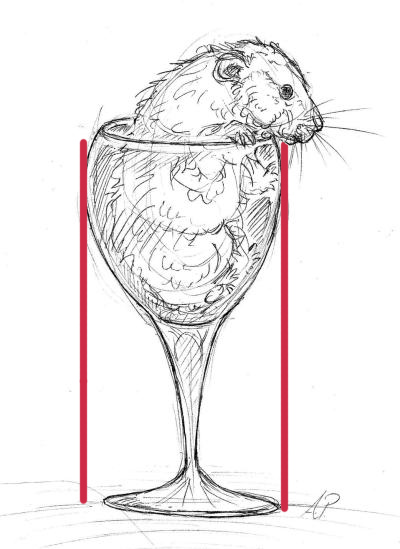 That's pretty much it, though, you did a wonderful job on this!
2010-06-10 [pegasus1000]: Nice job, I would like to see what the glass is sitting on or a horizen line at least. I like how you can see thorugh the cup.
2010-06-10 [NOOOPE]: I love the gesture of the lines. That, and what everyone else is saying about the bottom of the glass
2010-10-01 [Ravendust]: very cute :3 this is drawn extremely well done
2010-10-02 [Aeolynn]: My favorite part are the whiskers XD
2010-10-02 [Daisy_Sandybanks]: NEW IMAGE! :D
2010-10-03 [Chel.]: Very cool! I initially thought it was designed for something specific. Everything looks nice as far as I can tell. More refined lines would be by suggestion.
2010-10-03 [Aeolynn]: I have a horrendous time with trees, yours look very nice :)
2010-10-03 [Ravendust]: Very neat^^ you did great with this one
2010-10-03 [pegasus1000]: Cries. I miss California too!!! Nevada just isn't the same. Anyway, I like how you put the stare tree, flower, flag and international landmark all in one pic. I really with whoever did the state quarters had the same idea.
2010-10-03 [Pnelma Tirian]: Wooo California! Northern California is so beautiful. I'm in LA so I don't get to see it often but it's always a breath of fresh air! Great staggered composition, it has a nice flow to it.
2010-10-03 [Chel.]: I can't help but have this stigma against Californians. A lot of them seem a bit.... uptight/appear
2010-10-03 [Daisy_Sandybanks]: [Chel.] I actually agree with you. CA can be a very uptight state sometimes. It took me moving more than halfway across the country to actually realize that too. I was amazed at the friendliness of the people here in TN/KY.
But, although some people in CA may be a bit uptight and rude, not *everyone* is .. Amazingly, CA has some very caring, genuine citizens in it. :)
2010-10-03 [Chel.]: Oh yea, for sure. I mean... it IS a stereotype. There are stereotypes about people from WI too. Although it doesn't apply to everyone. Most stereotypes are true on a general sense.
2010-12-09 [Aeolynn]: Was this done in watercolors? the whole style of the painting is really nice :)
2010-12-09 [Daisy_Sandybanks]: Yep, watercolors. :)
Im still fairly new with watercolors, I like to just experiment with them every now and then.
I love using them though, they're so versatile. :)
2010-12-10 [The Dizzy Raven]: Breathtaking!!
2010-12-10 [pegasus1000]: So Pritty. I like how it fades around the edges. I am not sure if I like the white pathway
2010-12-10 [Daisy_Sandybanks]: The scanner sucked a lot of color out of it .. The pathway is actually grey colored.
2010-12-15 [Ravendust]: VERY lovely, I certainly wish I could paint heh
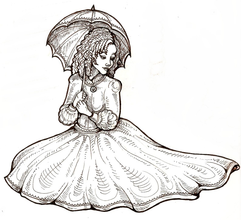
2011-02-10 [The Dizzy Raven]: That's pretty! :D You did an excellent job with the line art!
2011-02-10 [pegasus1000]: I agree. What a nice job. I like the expression on her face.
2011-08-10 [Eyonic]: :O those hands are so not bad, trust me! takes me more time to draw hands than the rest of the picture >.>
2011-08-13 [The Dizzy Raven]: Man, it's been a while since I saw this and I still love it :D
2011-10-26 [pegasus1000]: agrees with Artsy
Number of comments: 53 | Show these comments on your site |
|
Elftown - Wiki, forums, community and friendship.
|